Showing posts with label photoshop. Show all posts

Thursday, November 3, 2016

Halloween 2016: The Arts

It's the time of year again for the annual Karma Incarnate Halloween trip to California, which means two new shirt designs. Yay. I knew what I wanted to do for the Disney one way back in June, but alas I never got around to it... so at the last minute I had to do a little marathon session to make sure both designs were done in time to get printed.

So for the Disney one, obviously I had to go with something for The Twilight Zone Tower of Terror because in a few months it's going to be changed into something much, much more lame.
Disney shirt 2016
This one is alright, the balance is all off, but what can I say? I was on a tight deadline. I do like the way the lightning came out (probably the best I've ever done) and I'll be using the technique again in the future. Sadly, it didn't print out as well. I also like the static effect. There's a couple easter-eggs in there too, if you can spot them.

Honestly my favorite part of it is the 'Fearwell Tour' it made me laugh when I thought of it. Also, all the letters in it are customized from the base font to make it look more Twilight Zone-esque. I think I got the look pretty well.

What's that? You don't know what this is about? Well don't worry, I've got you covered.


*******************
And then the Universal one. This was a fair bit easier, but less satisfying in the end. I think the idea just never quite came together. Still, people seemed to like it okay.

Universal Shirt 2016
If you can't tell (and I wouldn't blame you if you can't) that's Freddy Krueger, Michael Meyers, Krampus, Jason Voorhees, and Leatherface behind the Crew. Those were the main haunts at Halloween Horror Nights this year, so it seemed appropriate. It was also quick, which was good because -again- time crunch.

I don't like this one as much... usually I do one serious one and one silly one. The Disney one invariably being more silly because it's Disney and more cartoony and fun whereas Universal is more serious. Oh well. 

The backs of the shirts (Universal Left, Disney Right)
The backs of the shirts were a little boring compared to last years, but they did their job and that's all that matters in the end.

Both shirts did perform fairly well this year, people were asking about them both because of the design and because of the Tower of Terror reference, at one point I declared Jake to be the Karma Incarnate Sponsored Tower of Terror Portable Information Booth, so that was good. I don't know if people really noticed the Universal ones all that much, a few did for sure, but that day is kind of a blur.

"One last time, relax have a drink with me one last time" 

Monday, May 2, 2016

A Joke Too Far...

Hey there,

Short post this time because it's late and I actually just remembered I could upload this here.

Console War, transparent background
Console War, black background
So what's this? Well, some of you may have seen this article showcasing an Xbox One with Stark Industries branding and an Arc Reactor embedded in the top. If you haven't, then click that link and you'll be all caught up. So obviously this is a tie-in to the upcoming Captain America: Civil War movie and the memes began flying almost immediately. I saw someone had made the Captain America: Console War joke already and I thought it was funny. Then I thought to myself, well, lets throw together that logo in Photoshop to make the joke funnier.

Suffice it to say, the joke was not funnier. In fact, I don't think anyone aside from me found it the least bit amusing... and after about an hour of editing, I saw that outcome coming... but I'd gone too far to quit so I finished it and here it is presented with both a black and transparent background. I'm happy with the result and actually it was pretty simple to build, just a huge pain for absolutely no reason. I guess we all make mistakes.

I'm also tossing up the actual logo for reference.
This is that actual logo I referred to literally seconds ago.
Now I'm the first to admit I didn't nail it exactly. I was working from a lower-rez version than you see above so I improvised somewhat and... again... joke. I was just going to capture the feel of it and got a bit greedy. All in all though, I am pretty happy with how it turned out.

"...you should not pick a fight with this person." 

Tuesday, November 24, 2015

Belated Halloween Arts

Greetings,

So as some of you might have realized, it was Halloween recently which meant it was time for the annual Karma Crew trip to Disneyland and Universal Studios. This also meant that it was time once again for yours truly to make some new t-shirt art. I couldn't post it before we left because we were trying to keep it a secret from two of the people going, and after that... well, I just got really busy ok?! Anyway, here now for your viewing enjoyment are those designs.

Disney shirt 2015
So this is the Disney shirt for this year, and if you're even remotely familiar with the park then you'll likely recognize the imagery from the Pirates of the Caribbean attraction. Last year, there were only four people who were going to be involved in this, and so the design had to change a fair bit from what I originally conceived. The trio was going to be the focus, featuring Jake, Rex, and Brock as the singing pirates and yours truly as the donkey.
© http://www.catsafterme.com/
But of course I couldn't just do it in my usual style, no, because I'm a fan of classic Disney and especially of Marc Davis' original drawings that inspired Pirates as well as a host of other famous Disney attractions. Wouldn't it be cool, I thought, to match the look of his original work rather than just the scene like I did last year?

And of course this was all well and good -last year- when I was just thinking about it. When it came time to actually DO it I began to realize what exactly I was in for. It'd been a long time since I'd studied any of Davis' work and his style is not only incredibly distinctive in terms of pose, proportion, and even the type of inking he did, but a far cry from what I do myself. It was going to be a pretty serious challenge for me to get it to look like it did in my head.

The internet, of course, provided a wealth of reference, but in the end I needed to buy this book which I wholeheartedly recommend for any fan of Disney or art in general. It doesn't feature all of his work, or even most of it, but it does provide an extremely broad view of the mans' talents.

Anywho, it took about three weeks worth of trial-and-error as well as teaching myself a new inking style (and digital watercolor) but I'm happy with the results. Check it out:

Jeremy, Rex, and Jake
Ayame
Taylor
The last two are only loosely based on existing pieces, the last one I couldn't actually find the reference for, so I winged it a fair bit. The overall look is good, but it's not as spot-on as the others. Fortunately, when they're combined, you can't really tell too much. 

********************

Next is the Universal Studios piece. This one was a wild card since I decided what I wanted to do for Disneyland way back last year, but never really settled on anything for Universal. A lot of ideas were swatted about, including one that I liked for Night Gallery. Sadly no one else did, so it was scrapped... until next year. 

Universal shirt 2015
I'm not crazy about this one... I mean, it's not terrible but I think I went a little overboard in some places. I was a little drained after the first shirt and this one was on a much tighter deadline. Still it came out alright, I suppose. In case it's not clear, it's all Alfred Hitchcock stuff... The Birds, Psycho, Rear Window, and Vertigo (left to right). 

The 'grain' filter I applied also was a bit heavy on print both for shirts and the poster we did. 

Both shirts, of course, feature the QR codes on the back, and match the front. This year, I didn't make the mistake of off-coloring the QR barcode so it was more recognizable. 

So there you have it. The Halloween 2015 shirts art at last. It was a fun year for these, even if they didn't really get the same result as last years. They were a fairly effective marketing tool and they're stylish. I'm fairly proud of the Pirate one too so... that's something. 


Saturday, August 1, 2015

Some Character Art I finished

So I did some more pony stuff, I know, it's a shock...but I'm posting it cause I finished it and because I think I did a pretty good job of capturing the look of the show on both pieces.

Shine from Equestria Girls
So if you haven't seen My Little Pony Equestria Girls or Rainbow Rocks you probably won't appreciate this one, but it's basically ponies as humans in a parallel universe. It's silly, but the music is great. Anyway, I made this for my friend Winter and I am thrilled with how it came out. The perspective was tricky because of their shape but I think the result was worth it.

Sapphire Night Classic
Sapphire Night Princess

Now these ones are a little more usual. It's Sapphire Night as a basic Alicorn (if such a thing exists, I guess) and then as a Princess. These ones match the look of the show which is good, but also they're both the same picture. I was able to work with layers and minimal editing to make one picture work for both. There's a reason I needed to do that, but frankly it's not interesting unless you roleplay, so I won't bore you. Suffice to say, it came out quite good, I feel.

Green Week logo


Prizes!
And because I'm super generous, I'm uploading some more straight-up Vector art I did. The first is the logo for Fillydelphia.com's Green Week event, which is basically Splatoon except for ponies. It's a week long event and this year they let me make the logo, which is cool. I also made the prize ribbons (above) which are very similar to the work I've done for MLPNWRP site... To be honest, I'm not in love with these ones, but I had to get them done quickly. I did learn more about Illustrator though, so... thats always a plus.

-Bad Seed, Bad Seed what we gonna do? 

Sunday, March 8, 2015

Some Randomness

So this was a rather interesting week. Among other things, I actually did some art...I liked it at the time, but obviously that couldn't last long. Still, I'm going to post it because, hey, that's what this blog is all about right? 

Karma sign
The first is a Karma project, well, actually it's for the Karma Connection newsletter that I put together every month. I needed a graphic to go along with an article about our group traveling to Las Vegas this month for the food handout, and so I came up with this:
This is a raster image done in Photoshop over the course of a few hours, not really sure how many cause I didn't keep track, but it wasn't too long. It's mostly just simple vector shapes duplicated and slightly modified to give the illusion of depth with a few badly placed shadows. I had some fun with the neon in this one as well as the textures. You can't tell (much) but every surface on this has a texture. Oh, the background is a stock photo (obviously).

Weather Graphic (with snow) 
The next one is this sign, it's a weather graphic for NewWorlds RP site that will be running a special event through Sunday. Those familiar with the MLP show will know what this represents, but for everyone else it's a yearly event where ponies 'clean up' winter and make it spring.

The chat has a somewhat interactive weather system with graphics, and this will be taking the place of them until the event is done. It's fun.

Whole thing is again vector/raster graphics done in Photoshop and Illustrator. A simple graphic that scaled down surprisingly well. The wood texture is a little better than the last wood signs I did in the same style and isn't too intrusive on the text. It IS a little large for what it was supposed to be, but it came out well. There's also a version without the snow. 

Map to Bitter Springs
Map graphic done to show the general location of Bitter Springs in relation to the train station and Dodge City done with raster graphics in Photoshop. This one took me a little more than an hour because I was trying to match a particular style. 

Sample 1
Sample 2
I think I nailed the look pretty well, without making any custom brushes or anything. 

I'll be honest, I'm thinking about revisiting this one. Obviously it's supposed to be more representational than an actual functional map, but I don't know. It seems very plain. It was just something I've wanted to do for a really long time and so now that I have, I'm posting it. If it gets updated, I'll post the revision here too. 

There were others (I know, can you believe it??) but I can't post them here yet. Not until the things they are attached to are farther along. I'm honestly not sure why I care, as literally no one looks at this, but hey, it's my blog and I'll do what I want. 

"Very well, Bart. I shall send you to HEAVEN...before I send you to HELL." 
-Sideshow Bob

Saturday, October 18, 2014

Universal Shirts - Behold my failure

Okay so I showed you the Haunted Mansion shirts for the Disneyland trip, but on the last day, we're actually going to Universal Studios as well. I had a really simple design for a shirt for it...it was pretty boring honestly. I sort of made it quickly, but the guys liked it. Turned out certain bad habits prevented it from being used and so I had to start from scratch. Coming off a relative high from the other shirts I decided to make something more unique for Universal as well.

It turned out to be a rather serious lapse in judgement on my part.

Here's the lineart...which, I don't know. I still don't hate.

Lineart
Can you tell what it's supposed to be? Yeah, don't feel bad. No one else can either. I'll give you a hint. The Wolf Man, The Monster, Dracula, and The Bride. No, not Uma Thurman. The other one.

Colors...sort of. 
And as you can see in the shading phase, things went tragically, horribly, terribly wrong. I suppose it's my fault. Because I did it and all. Maybe I'm just out of practice with my tablet.

The design
Anyway, as I said, I'm going to post things here that are good and bad. This is the latter, but I posted it anyway. So I'm still ahead in the point spread!

"As 6?"

Thursday, August 29, 2013

Karma Card designs

Hey everyone,

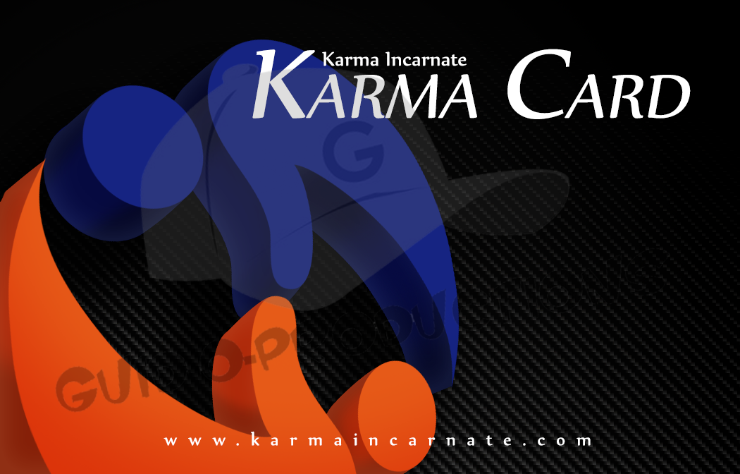
So one of the companies I freelance for, Karma Incarnate, is switching to plastic cards to pay out to their employees (it's actually a little more complicated than that, but not the point of this post) and so I thought it might be neat to show some of the designs that weren't selected. You may ask why I would like to show off work that didn't make the cut and the answer is simple. I think they're all pretty great, and while only one could be selected, it's the one I can't share for obvious reasons. So take a look at these.

The point of this project was to have a card that will get people talking about the company when used. 


     So this is card number one based off the rough concept that my boss gave me. It's mirrors the website well, and of course it has the official colors and branding and stuff. Ultimately, this design was rejected because it looked too much like a personal (customized) credit card and it's a bit too busy.


This is the second and my personal favorite. To me, this one says 'Karma' really well in the form of what looks like an old leatherbound book (or technically, card...) We went back and fourth with this one, trying out all different colors of leather and variations on silver accents.


This is the third, and the one closest to the one we're actually using. The logo is the focus here, though it's more design than straight branding which makes the whole thing look a little more modern. The background is carbon fiber...we went through SO many different background types, but nothing else gave it a subtle enough pattern without being boring. Also, the carbon fiber adds to the more modern look which is really what this one is all about. The name of the card is also highly visible which makes it a good talking point. Interestingly enough, the first pass at these, this was the least popular design.

So there you go. When the cards are done, I'll post a photo of the finished design so you can see how they ended up against these designs.

"I'll tell you what -just buy me a couple pairs of short-pants and we'll call it even."
-Bobby Hill