Showing posts with label karma. Show all posts

Thursday, November 3, 2016

Halloween 2016: The Arts

It's the time of year again for the annual Karma Incarnate Halloween trip to California, which means two new shirt designs. Yay. I knew what I wanted to do for the Disney one way back in June, but alas I never got around to it... so at the last minute I had to do a little marathon session to make sure both designs were done in time to get printed.

So for the Disney one, obviously I had to go with something for The Twilight Zone Tower of Terror because in a few months it's going to be changed into something much, much more lame.
Disney shirt 2016
This one is alright, the balance is all off, but what can I say? I was on a tight deadline. I do like the way the lightning came out (probably the best I've ever done) and I'll be using the technique again in the future. Sadly, it didn't print out as well. I also like the static effect. There's a couple easter-eggs in there too, if you can spot them.

Honestly my favorite part of it is the 'Fearwell Tour' it made me laugh when I thought of it. Also, all the letters in it are customized from the base font to make it look more Twilight Zone-esque. I think I got the look pretty well.

What's that? You don't know what this is about? Well don't worry, I've got you covered.


*******************
And then the Universal one. This was a fair bit easier, but less satisfying in the end. I think the idea just never quite came together. Still, people seemed to like it okay.

Universal Shirt 2016
If you can't tell (and I wouldn't blame you if you can't) that's Freddy Krueger, Michael Meyers, Krampus, Jason Voorhees, and Leatherface behind the Crew. Those were the main haunts at Halloween Horror Nights this year, so it seemed appropriate. It was also quick, which was good because -again- time crunch.

I don't like this one as much... usually I do one serious one and one silly one. The Disney one invariably being more silly because it's Disney and more cartoony and fun whereas Universal is more serious. Oh well. 

The backs of the shirts (Universal Left, Disney Right)
The backs of the shirts were a little boring compared to last years, but they did their job and that's all that matters in the end.

Both shirts did perform fairly well this year, people were asking about them both because of the design and because of the Tower of Terror reference, at one point I declared Jake to be the Karma Incarnate Sponsored Tower of Terror Portable Information Booth, so that was good. I don't know if people really noticed the Universal ones all that much, a few did for sure, but that day is kind of a blur.

"One last time, relax have a drink with me one last time" 

Sunday, October 5, 2014

Haunted Mansion shirts

Hello,

So I managed to make it all the way through September without posting anything. I would have taken this as a failure of my goal at one time, but ah, not this time. No, because now we're only a couple days into October and I'm posting something I actually like. Woo. 

So the company I do volunteer work for, Karma Incarnate, is taking me to Disneyland in a few weeks time and they wanted shirts made. I made a fairly poor showing which I'm not going to post here, because it's terrible and as soon as I'd finished it, underwhelmed as I was (but working with a fairly narrow deadline) I accidentally came up with something I liked better.

Before I show the finished piece, I'm going to post the originals because for some reason, all my best work is done in pencil. I don't think there's been a single thing I've ever drawn in which the inks and colored version look as good to me as the pencil sketches...but who knows? I've gone ahead and added the vector version next to the pencil one for comparison sake. 

Ghostly Rex

Ghostly Jake

Ghostly me
Ghostly Brock
Those are the individual versions. I think they came out quite well, all things considered. Here's what they look like in a set with a background (this is also the image which ended up being on the shirt).

Hitchhikers

Yeah, I think it's pretty great. Don't know about you, but I do. The coloration ended up being a little different than I'd wanted/expected, but it's not terrible and sort of has the look I wanted. 

Oh, hell, okay. Here's the one that I didn't like very much...

Rejection!
Yeah, it's a pretty poor bit of photo manipulation. May have been an off night, maybe it was just a stupid idea to begin with. Probably both. Maybe I just suck at it? Yeah, it's probably that one. Just know that the elements are there for something not quite so terrible. Maybe. 

So that's it for now. Some lovely character and vector art. Oh, and as a bonus, since almost no one ever sees my blog, I'll post some bonus art that I did for this. Enjoy!

It's bonus, so just deal with it. 
Now this one, I did it as an afterthought. I did the sketch first and was like...oh, I have three hours to kill here at work, so I'll just bang it out. In the end, obviously it falls apart on many, many levels...most notably the shadows which...ugh. Went way further than they should have. Still. I got all the way through the inking stage. Go me. 

"It's her own fault I didn't save her." 
                        - Tom Stewart

Friday, August 29, 2014

Karma Sculpture Project

Hey folks,

Been awhile since I posted last. I really am going to try and do that more frequently as I do projects, regardless of how I perceive their quality. So with that in mind, today I am going to show some in-progress shots of a sculpture I've made.

First, a little background on the project.

Next April, Karma Incarnate is going to FanX in Salt Lake City. It's going to be our first booth and we needed something of a draw -a centerpiece sort of thing. From that, I came up with this. The idea was sort of a shrine-structure, something that represented how long the idea of karma had existed. Since we primarily use Japanese -and especially Buddhist- imagery I started there, researching mostly shrines found in Japan. I found some pretty interesting ones, but it wasn't until I stumbled upon a specific pagan shrine that I found what I was looking for in terms of design.

Sample Sheet 1
Through the concept phase you can see where I toyed with the Japanese style shrines for awhile. They tend to have vertical stones set into a flat base (the original idea came from one that a co-worker took while in Japan). But the more I thought about it, the less I liked it. Mostly because though it would be easy to construct, they looked very similar to one another.
Sample 2
As you can see from the other samples, there was a lot I considered, even before I found the shrine shape I liked, there was a lot of mess about the base. While I like the ideas behind many of these, none of them really worked for me. In addition to being incredibly difficult to fabricate at full-size, they all look...wrong.

I did also begin toying with the idea of something besides stone. I worked with the idea of a cracked boulder...which I still really like, but never really worked out as well as I hoped it would. It was also here where I settled on the basic shape for the main stone as well as the overgrown look. I wanted to push that a little further...but I just wasn't sure the payoff would be worth it.


Final sketches
When I finally had the shape I wanted and found the shrine type I wanted to use, I began making a few final concept sketches for what I was looking for. I used reference again for the vines, and I liked the extras, I think it looks more natural that way, but they began to interfere with the base...again, making final fabrication too difficult considering my experience. I didn't want to go too overboard.

Final Turnaround
At this point, the design was finalized. I was happy with the overall look of it, smooth on the front, deliberately showing off the logo, rough cut on the back with a bit of an arc to keep the silhouette interesting. The vines were still a bit sparse, but I think I reached a good balance, and if I want to add more foliage later, I can do that in other ways.

That's all for now. Next (related) post I'll have pictures showing off some of the construction process for the sculpture (the model version) and then as we get closer to FanX, I'll show pictures of the full-sized one under construction.

Until next time!

"My dad just passed away- I stuck his head in the DEEP FRYER!"

Thursday, August 29, 2013

Karma Card designs

Hey everyone,

So one of the companies I freelance for, Karma Incarnate, is switching to plastic cards to pay out to their employees (it's actually a little more complicated than that, but not the point of this post) and so I thought it might be neat to show some of the designs that weren't selected. You may ask why I would like to show off work that didn't make the cut and the answer is simple. I think they're all pretty great, and while only one could be selected, it's the one I can't share for obvious reasons. So take a look at these.

The point of this project was to have a card that will get people talking about the company when used. 


     So this is card number one based off the rough concept that my boss gave me. It's mirrors the website well, and of course it has the official colors and branding and stuff. Ultimately, this design was rejected because it looked too much like a personal (customized) credit card and it's a bit too busy.


This is the second and my personal favorite. To me, this one says 'Karma' really well in the form of what looks like an old leatherbound book (or technically, card...) We went back and fourth with this one, trying out all different colors of leather and variations on silver accents.


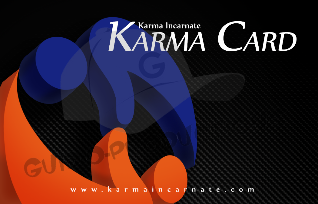
This is the third, and the one closest to the one we're actually using. The logo is the focus here, though it's more design than straight branding which makes the whole thing look a little more modern. The background is carbon fiber...we went through SO many different background types, but nothing else gave it a subtle enough pattern without being boring. Also, the carbon fiber adds to the more modern look which is really what this one is all about. The name of the card is also highly visible which makes it a good talking point. Interestingly enough, the first pass at these, this was the least popular design.

So there you go. When the cards are done, I'll post a photo of the finished design so you can see how they ended up against these designs.

"I'll tell you what -just buy me a couple pairs of short-pants and we'll call it even."
-Bobby Hill