So one of the companies I freelance for, Karma Incarnate, is switching to plastic cards to pay out to their employees (it's actually a little more complicated than that, but not the point of this post) and so I thought it might be neat to show some of the designs that weren't selected. You may ask why I would like to show off work that didn't make the cut and the answer is simple. I think they're all pretty great, and while only one could be selected, it's the one I can't share for obvious reasons. So take a look at these.
The point of this project was to have a card that will get people talking about the company when used.

So this is card number one based off the rough concept that my boss gave me. It's mirrors the website well, and of course it has the official colors and branding and stuff. Ultimately, this design was rejected because it looked too much like a personal (customized) credit card and it's a bit too busy.

This is the second and my personal favorite. To me, this one says 'Karma' really well in the form of what looks like an old leatherbound book (or technically, card...) We went back and fourth with this one, trying out all different colors of leather and variations on silver accents.
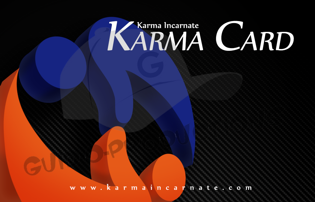
This is the third, and the one closest to the one we're actually using. The logo is the focus here, though it's more design than straight branding which makes the whole thing look a little more modern. The background is carbon fiber...we went through SO many different background types, but nothing else gave it a subtle enough pattern without being boring. Also, the carbon fiber adds to the more modern look which is really what this one is all about. The name of the card is also highly visible which makes it a good talking point. Interestingly enough, the first pass at these, this was the least popular design.
So there you go. When the cards are done, I'll post a photo of the finished design so you can see how they ended up against these designs.
"I'll tell you what -just buy me a couple pairs of short-pants and we'll call it even."
-Bobby Hill
